
KYC Redesign
Redesigning the identity verification flow behind Greece's major banks, from UX audit to launch.
00

problem
Verifying your identity online shouldn't feel like a test. Customers of banks like Alpha Bank and organizations like OPAP were dropping off mid-verification. Screens were dense, instructions were vague, and users couldn't tell what to do next or whether a step had worked.
solution
A guided flow where every screen asks for one thing. I audited the full KYC journey, then redesigned it around clear steps, plain microcopy and strong feedback states, across web and mobile. The redesign has since launched.
In a KYC flow, uncertainty means drop-off.

Intelli Solutions runs the platform banks use to verify new customers online: OTP, ID document, supporting documents, selfie and video call. Each bank uses a different verification method, and the backend check takes around five minutes, so the interface has to carry the user through the wait.
year
2025–2026
timeframe
6 months
tools
Figma, FigJam
category
UI/UX

the audit
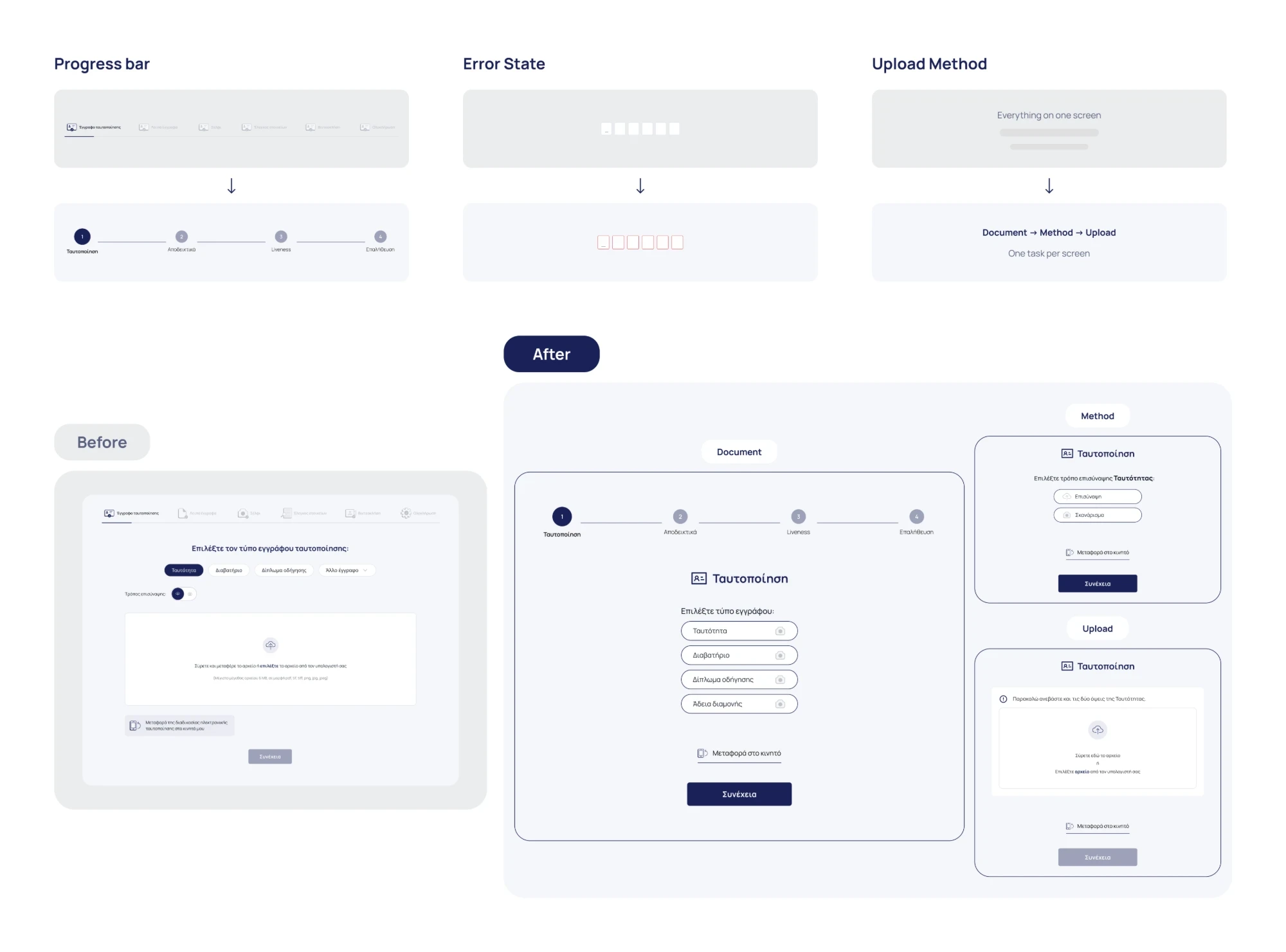
I audited every screen of the live flow, marking what worked, what didn't, and how urgent each issue was. Findings fell into five themes: missing feedback states, dense layouts, unclear microcopy, a progress bar that didn't match the real steps, and confusing upload and scan options.
the principles


the flow
I mapped the full user flow, including the edge cases: wrong or expired codes, retakes, switching between upload and scan, and moving from desktop to mobile mid-process. One structure now works for every document type and every bank.
small changes, clearer path
Six progress steps that looked like buttons became five numbered stages. Errors now appear on the field that caused them. Uploading starts with choosing the document, then the method, then both sides, with a clear success state at the end.
the final UI
The launched flow, from code verification to document upload and scan. Every screen has one clear action, plain instructions, and feedback the moment something succeeds or fails.

In regulated products, every word affects trust. Microcopy changes did as much as layout changes.
Designing for stakeholders I couldn't speak to directly taught me to make my reasoning visible, so feedback came back focused.
The client came back for a redesign of their internal Agent Portal, the tool staff use to verify customers during live calls.

